One of the small blessings of the weirdness that has been the first half of 2020 has been the extra time to get stuff done.
I’ve spent a good chunk of that extra time adding polish and improvements to Plumber 2, or Plumber for Umbraco 8, aka that workflow thing I built.
It’s at the point now where v1.2.0 is pretty much ready for prime-time, after a couple of months of work and a bit of testing and tweaking.
There’s a slew of new features in the next release, so sit down, grab a coffee/whiskey (no alcohol before 10am, quarantine rules), and let’s run through what’s new in Plumber 1.2.0.
The content app
Content app, context app. Potato potato. Tomato tomato. That doesn’t work with the written word. Whatever.
Most importantly, the content app has a new backoffice icon. Everyone loves a good icon, and this one is better than the old one.
The content app has seen a bit of UI love, to make consistent use of color and better use of the available screen territory.
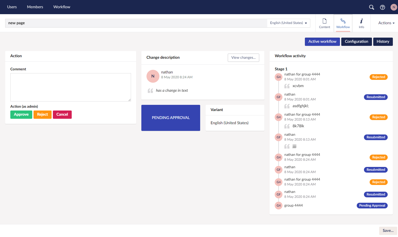
Active workflow view
On wider screens the dashboard presents in three columns, from left being actions, description and activity. Of course this layout is responsive and wraps beautifully into a double or single column layout depending on the device.
The description has been expanded from earlier versions to include a big bold status badge for the current workflow, and a cheeky button for viewing the changes made in the current workflow instance.
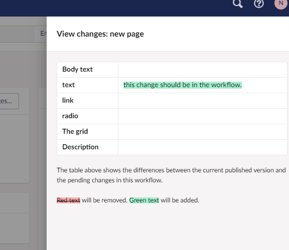
Viewing changes is a licensed feature, because if I gave it all away for nothing, there’d be no incentive part with a few rubles for a (very affordable) license…
View changes uses a familiar interface (see: Umbraco rollback) to highlight the changes between the current worflowed document and the current live version. This works for old workflow processes too, showing the changes before and after the workflow was approved. Neat!
The activity column also sees some UI polish, with clearer nesting of related tasks (ie the back-and-forth between two users when a workflow task is rejected and resubmitted multiple times).
When initiating a new workflow, it’s now possible to set a scheduled date for releasing the changes. If the date passes before the workflow is approved, the changes will be released when the workflow is completed.
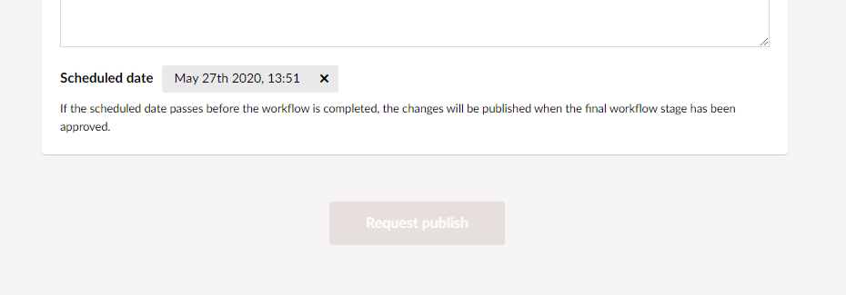
This was previously available using Umbraco’s built-in scheduling options, but was a bit disconnected from the rest of the workflow interface. Changes here make the scheduling options available in the right place at the right time, so user don’t need to go hunting.
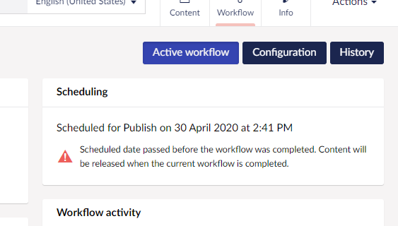
The scheduling status for a given workflow is displayed in the content app and all dashboard task lists (history, pending tasks, user submissions).
Configuration view
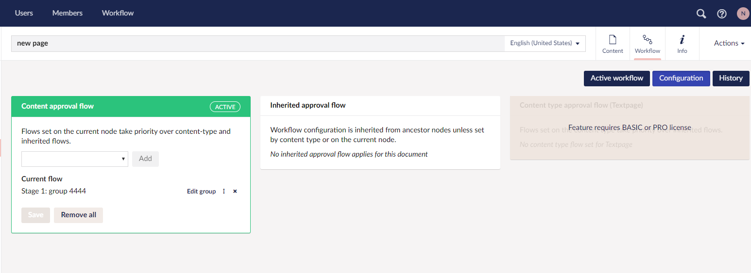
More UI updates, again with the three columns, which works pretty nicely given the view has three cards - one each for Content approval flow, Inherited approval flow and Content type approval flow
Content approval flow has a new option for removing all stages with a single button click. Great for updating workflows with lots of groups.
Notification banner
Where previously the workflow state for the current node was a snip of text next to the footer buttons, it’s now a much more prominent banner at the top of the content editor.

It makes much more sense that editors see this message before the content because it will impact their subsequent actions - they’ll know the node is in a workflow before starting to make changes.
On that note, locking content now really locks content. If Workflow > Settings > Lock active content is true, backoffice users will not be able to edit nodes while they’re in a workflow. Which makes perfect sense, because the active workflow should be preserved (but if you want to allow edits, that’s fine too, just leave the setting as false).
Charts
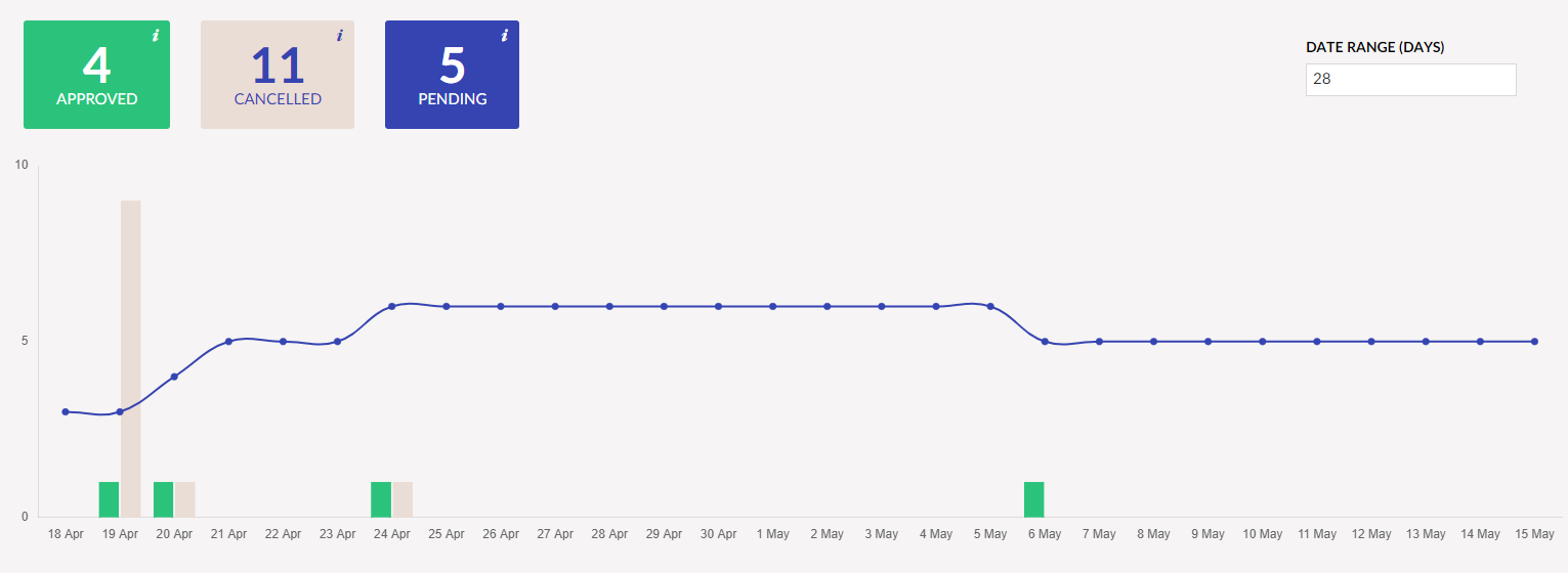
Are better looking than ever before. They’ve been simplified to track approved, cancelled and pending tasks, which makes it considerably easier to absorb the data at glance.
Click-throughs from the chart header tiles work again, landing on a history view for the selected workflow status. History is at the task level rather than the instance level, so is extra detailed.
Dashboards
Perhaps one of the most useful new features in 1.2.0 is the ability to action workflows from the dashboard. No longer will users need that extra click to load the content node, they can process pending tasks from the comfort of the dashboard.
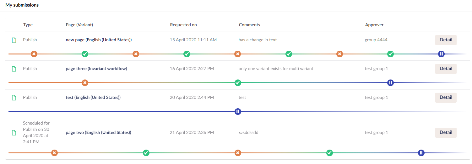
Where previously the right-most cell in the dashboard row held an action button (cancel only), and a button for opening an overlay detailing the current workflow, there’s now a single Detail button.
The Detail button launches a big old infinite editor view, loading the Active workflow view from the content app.
If the current user has permission to action the workflow, they’ll have the controls to do so, along with other useful data about the workflow - the change description, current status, scheduling (if any) and the workflow activity list.
This means users won’t have to engage with the actual content if they don’t feel the need. They can review and action tasks quickly and easily, with their actions syncing to other user’s dashboards via the magic of signalR.
Offline approval
This now works. I think. By fiddling with cookies and authentication, it’s possible for workflow tasks to be reviewed and approved without the user logging in to Umbraco. It won’t work with multi-variant workflows (yet), but that’s not really an issue since no one has purchased a license to enable this feature.
Other stuff
Visible changes are great and all, but there’s a heap going on under the hood too.
Logging has been improved to actual store useful messages.
The entire javascript application has been rewritten using ES6 modules, and the old Grunt task runner replaced with Gulp, mainly because the latter plays really nicely with Babel and generally has an all-round more pleasant syntax.
Shifting to modules means a looser coupling with AngularJs, which probably isn’t a big deal given that’s what Umbraco’s built on and likely will be for the mid-term (my opinion), but it’s comforting to know that I could feasibly move to a new framework without too many tears.
Just for fun, here’s a example of the changes from a typical AngularJs directive, to the modular version:
(() => {

    function impersonationBanner($compile) {

        const template = `
            <div class="alert text-center">
                <p>Plumber license impersonation is active. All  features are available on localhost only.</p>
            </div>`;

        const directive = {
            restrict: 'A',
            link: (scope, element) => {
                const currentSubscription = Umbraco.Sys.ServerVariables.PlumberSubscription;

                scope.impersonating = currentSubscription.isImpersonating;
                scope.type = currentSubscription.type;

                if (scope.impersonating) {
                    element.prepend($compile(template)(scope));
                }
            }
        };

        return directive;
    }

    angular.module('plumber.directives').directive('impersonationBanner', ['$compile', impersonationBanner]);

})();
export class ImpersonationBanner {
    static name = 'impersonationBanner';

    constructor($compile) {
        this.$compile = $compile;
        this.restrict = 'A';
    }

    link(scope, element) {
        const currentSubscription = Umbraco.Sys.ServerVariables.PlumberSubscription;
        scope.type = currentSubscription.type;

        if (currentSubscription.isImpersonating) {
            const template = `
                <div class="alert alert-workflow">
                    <i class="icon icon-alert"></i>
                    <p>Plumber license impersonation is active. All <span class="umb-badge"></span> features are available on non-production domains only.</p>
                </div>`;

            element.prepend(this.$compile(template)(scope));
        }
    }
}
The new syntax is a bit more succinct, and abstracts away a lot of the AngularJs specifics - notice DI in the modular version is managed in the constructor only, no need for the angular.module... declaration? DI is managed via the ngInject package, which means one less AngularJs bit to worry about.
There are some new files required to create modules (AngularJs modules, not ES6 modules) for components, directives, services et all, but that’s a good thing. Modular code is easier to manage.
Fin
And that’s the current state of play in the Plumber workflow world. A substantial update, a few new features, a prettier workspace, and a more robust product. All the tests pass. Is it perfect? Not even close, but better than v1.1.3.
It’s on nuget now => Install-Package Plumber.Workflow